Monitoring Solution for Automotive IT Landscape
My Role
- Hosting design and feedback sessions with stakeholders
- Identification of use cases for concept and ideation
- Aligning and validating UX concept requirements with the development team
- Design Sprint lead and host
Process Timeline
Requirement definition, user roles mapping, scoping & planning
User journey mapping, ideation & solution sketching, wireframing (low fidelity)
Wireframe iteration, interaction patterns definition, early usability walkthroughs
High-fidelity wireframes, interactive prototype, visual compass
Validation testing (expert review), design iterations
Final UX/UI polish, final prototype, pitch deck
Case detail
The Challenge
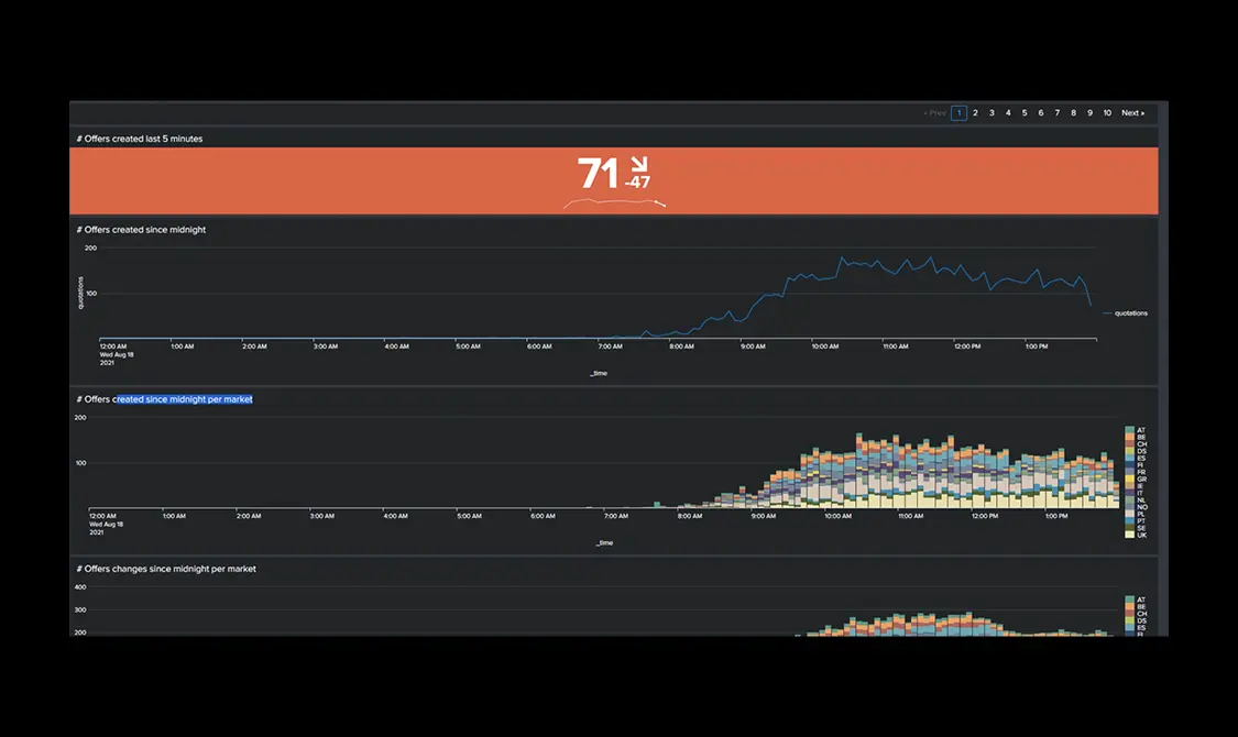
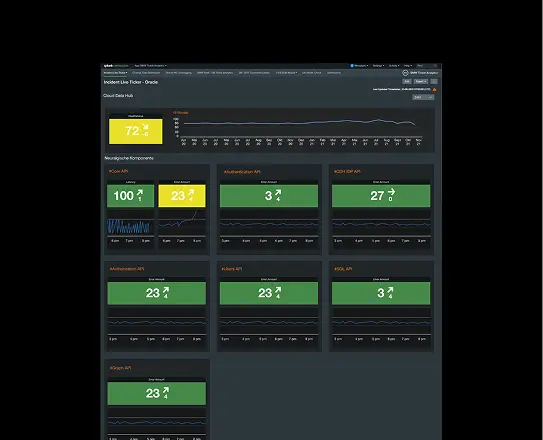
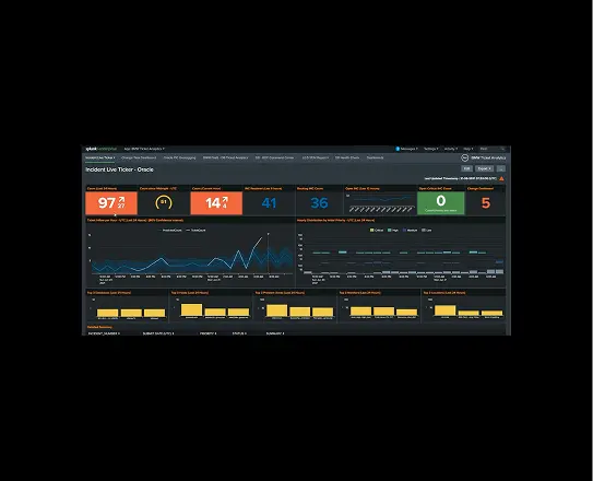
The challenge
Before any concept work could begin, we needed to understand what already existed. The automotive company's IT landscape spanned multiple regions, systems and teams – but visibility into system health was fragmented across tools, dashboards and spreadsheets, each built for a different audience with no shared source of truth.
Understanding the current implementation
We started by auditing the existing monitoring tools and reporting formats in use across the organisation. This meant sitting with stakeholders to see how they actually consumed IT data day to day – not just what dashboards existed, but which ones were trusted, which were ignored and where people fell back to manual reporting because nothing else gave them what they needed. This groundwork exposed the real gap: no single view connected operational detail to business impact.
Case detail
Defining the User Landscape
Mapping distinct relationships to the data
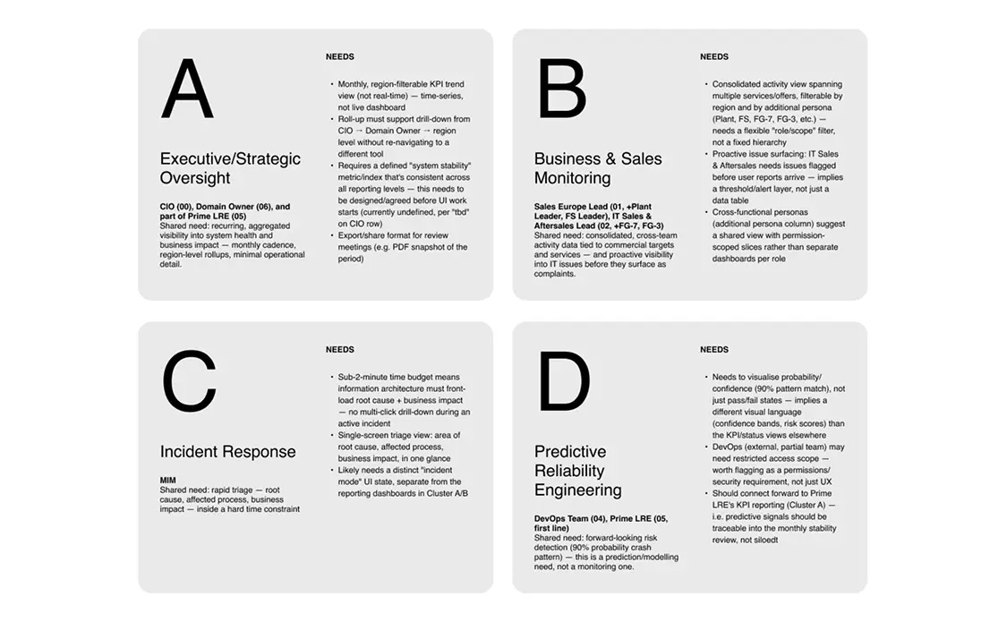
IT monitoring means something different depending on who's looking at it. Before designing anything, we mapped out the distinct user groups the solution would need to serve, each with a different relationship to the data:
- Executive / Strategic Oversight – needs a high-level, recurring view of system stability tied to business outcomes, not operational detail
- Business & Sales Monitoring – needs consolidated activity data across regions and services, often flagged proactively before issues escalate
- Incident Response (Reactive) – needs to triage root cause and business impact within minutes during an active incident
- Predictive Reliability Engineering – needs detailed incident overview and forward-looking risk signals to anticipate failures before they happen and to identify recurring patterns
Rather than trying to solve for all four groups at once, we made a deliberate scoping decision.
Focusing the first phase on Executive / Strategic Oversight
This group sat at the top of the reporting chain and had the clearest, most immediate need: a way to see system stability and business impact at a glance, without wading into technical detail. Prioritising this persona gave us a concept we could validate quickly and use to anchor the vision for every other user group that would follow in later phases.

Case detail
Concept, Iteration and Validation
From literal dashboards to a spatial metaphor
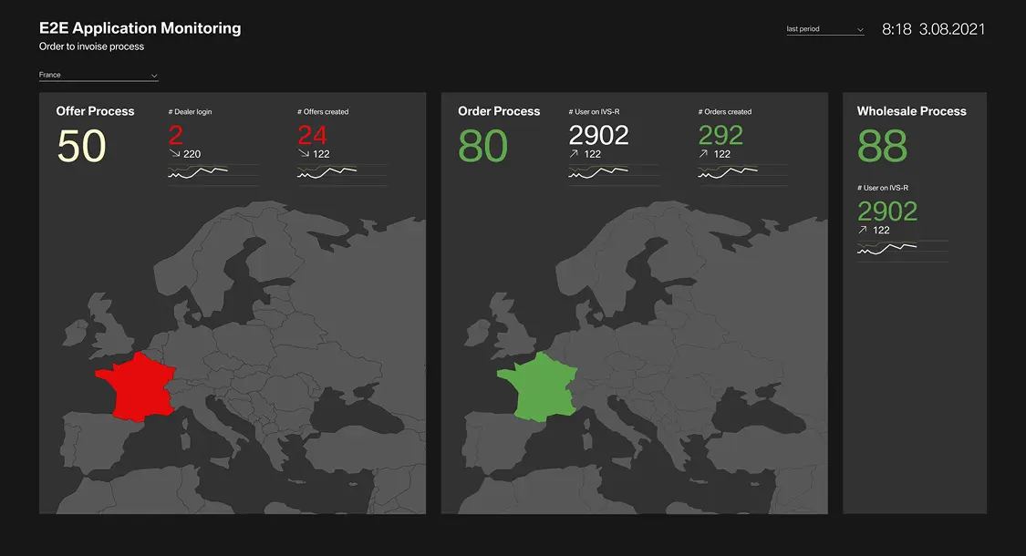
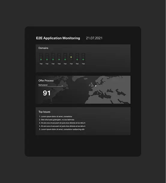
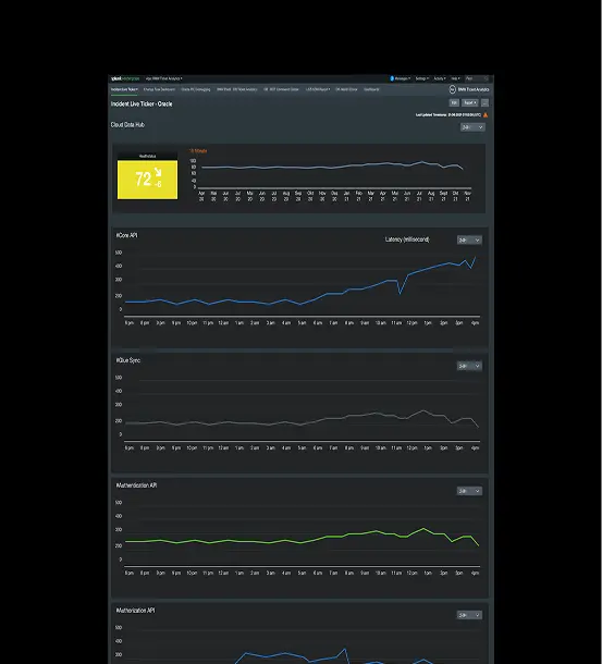
With the Executive / Strategic Oversight persona as our focus, we moved into concept development: what would "overview and reporting" actually look like for someone who needs a monthly, trustworthy read on system health?
The approach
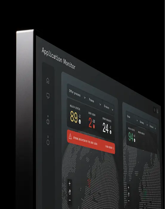
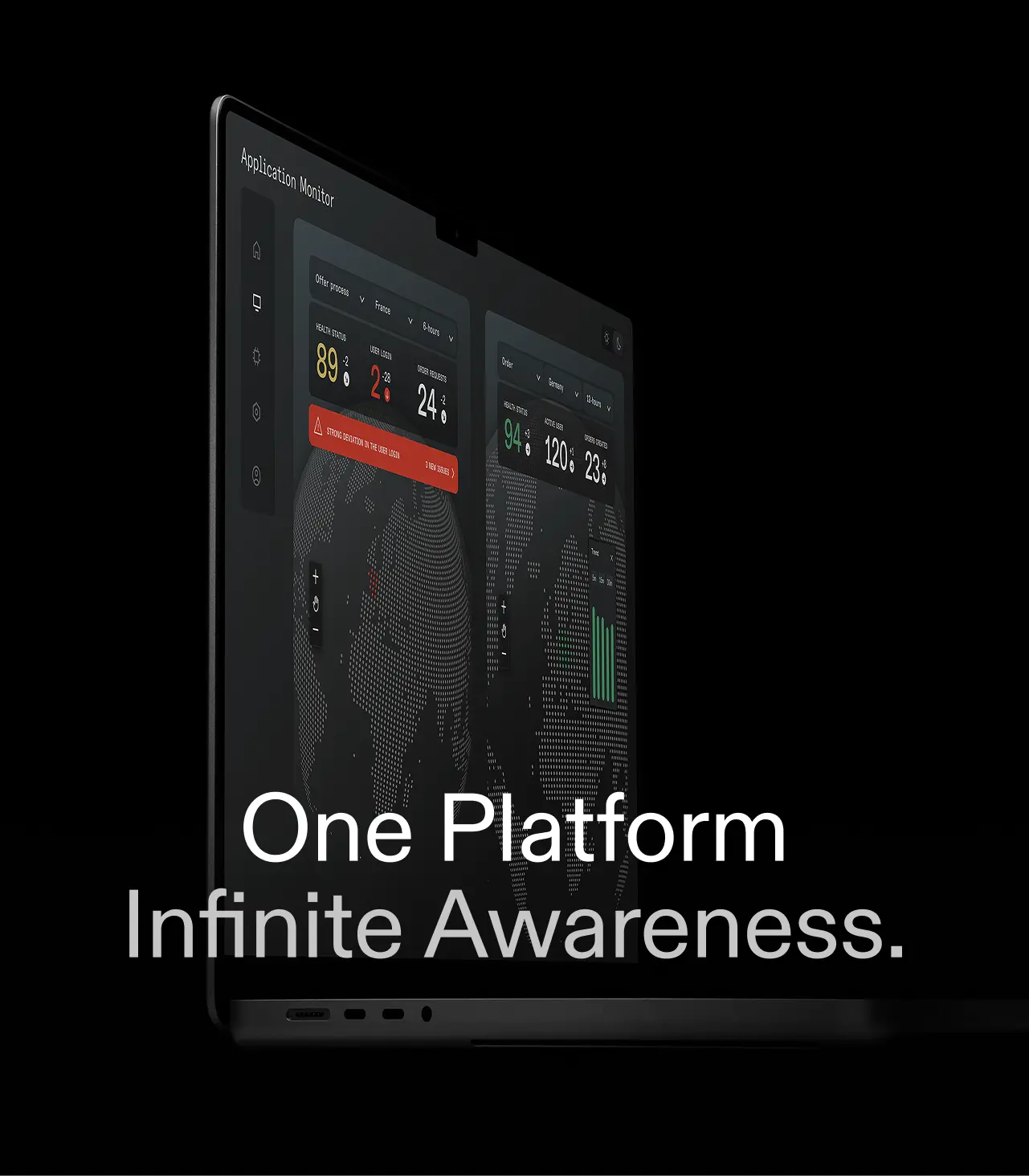
We iterated through several directions – from literal dashboard layouts to more visual, spatial metaphors – before landing on the core idea: a tangible, almost playful 3D map of the IT landscape, paired with split-screen views into underlying data sources and a highly visual KPI summary. This let us translate dense operational data into something an executive audience could read instantly, without losing the ability to drill into specifics when needed.
Validated with stakeholders
Each iteration was tested and refined directly with stakeholders, keeping the concept grounded in what this audience would actually trust and use – not just what looked compelling in a deck.
Case detail
Building the Foundation
Aligning with development
A concept only holds up if it’s buildable. Alongside stakeholder validation, we worked with the development team to pressure-test UX requirements against technical feasibility – walking through data sources, integration points and system constraints and adjusting the concept where reality demanded it. The result stayed ambitious, but implementable.
A lightweight design system
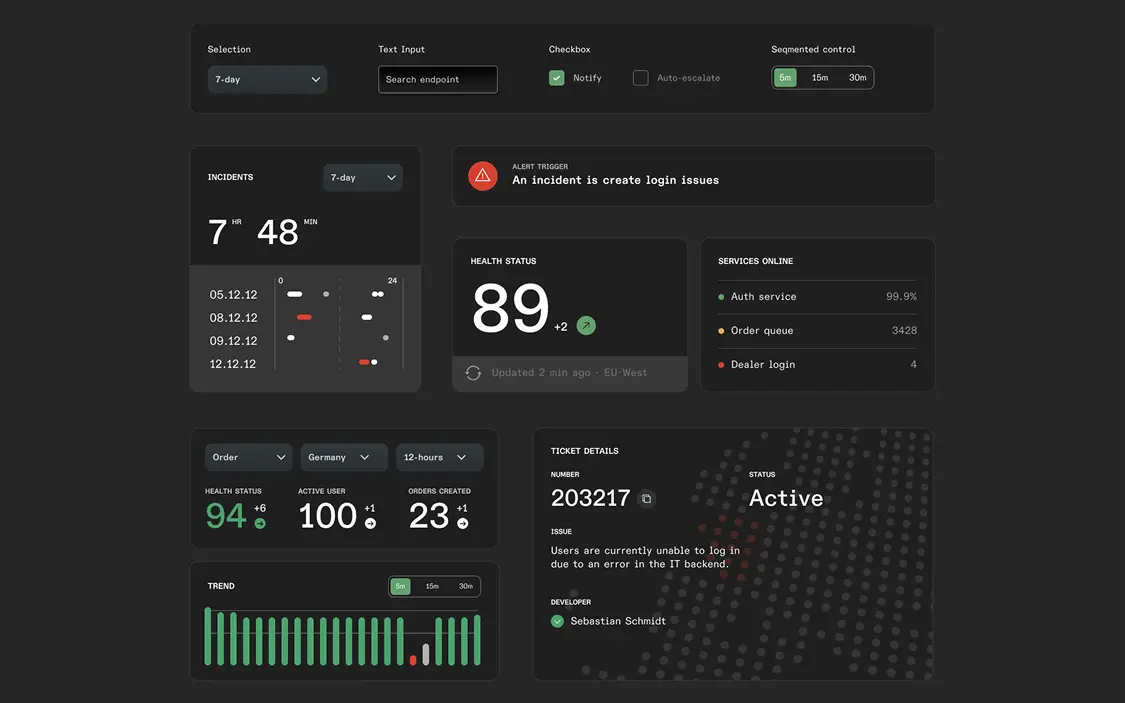
We established a basic design system – core components, colours and interaction patterns – giving the prototype visual consistency without overbuilding for a concept still finding its shape. It was designed to scale into future phases covering the remaining user groups.
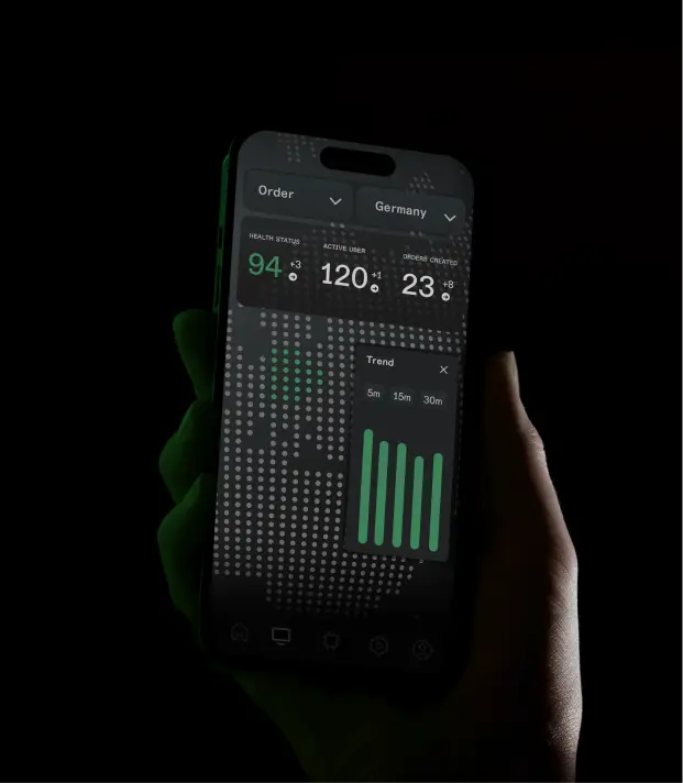
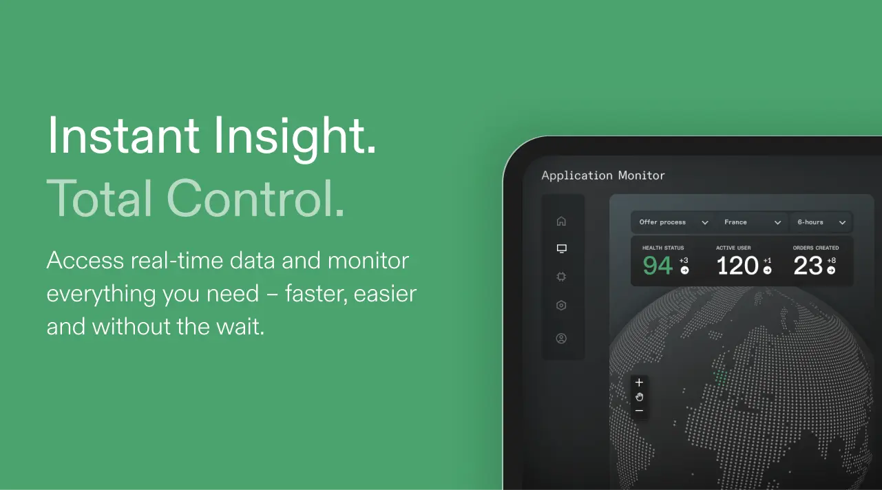
Mockups and UI for the pitch deck
We translated the validated concept into polished mockups for a management-facing pitch deck – clear enough for a non-technical audience, credible enough to show the work behind it.
Let's Connect
These are first samples that demonstrate how I work. If your product needs this kind of thinking: I'm one message away.